
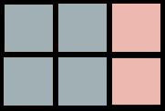





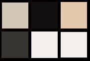

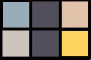

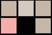

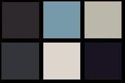

Repitition of color and Harmony of color are usually used in photos of this season.
Color used in this catalogue are all very creamy colors (pink, creamy white, beige, pale blue, pale yellow-orange, blue-grey, black-blue). Color usage in every photo are very consistent, yet a variety of color combinations and proportion are used.
Feeling and mood of photos are very unique and matched, achieving harmony of colors.
Feeling and mood of photos are very unique and matched, achieving harmony of colors.
*
Balance of color
Alternation of color
Emphasis of color
Balance of color
For other seasons, very different color family are used for each season photo-shooting. Color family used in ad can very effectively present the brand's seasonal theme.


沒有留言:
張貼留言